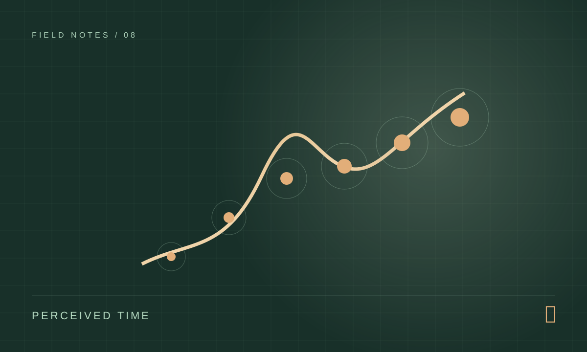
A visitor clicks a campaign link, sees a blank space, then a large image, then a heading that shifts down when a font arrives. Analytics may record the page as loaded, but the person has already formed an opinion. Performance is experienced as a sequence of events, not a single finish line.
A page can load and still feel late
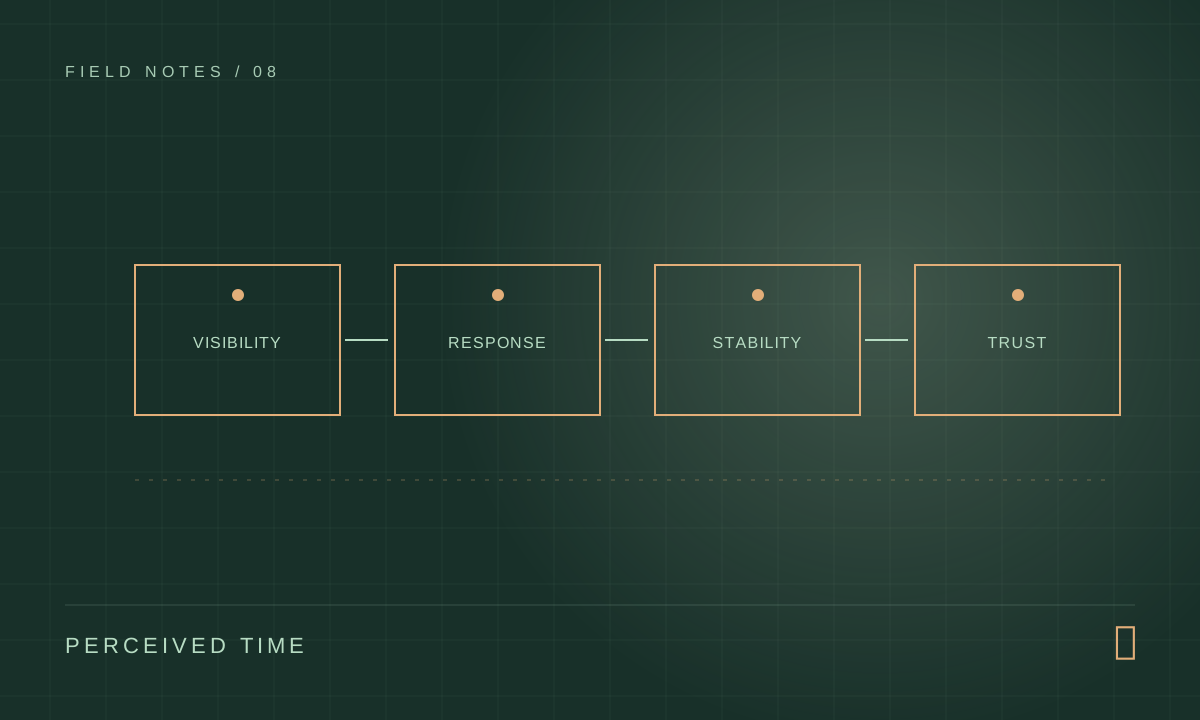
Google’s Core Web Vitals help describe that experience: Largest Contentful Paint tracks when the main content becomes visible, Interaction to Next Paint reflects responsiveness to input, and Cumulative Layout Shift measures unexpected movement. They are diagnostic signals, not a substitute for watching a person complete a task.
- Make the main story visible promptly.
- Make taps and clicks respond without hesitation.
- Keep the layout steady while assets arrive.
Find the actual largest element
On an editorial portfolio, the largest contentful element may be the hero image or a large heading. If it is an image, reserve its dimensions, serve an appropriately sized format and avoid delaying it behind a client-only animation. If it is text, font loading and render-blocking work may be the problem. Run PageSpeed Insights and inspect the actual element instead of applying a list of generic optimizations.
Give supporting images lazy loading, but do not lazy load the image people need to see first. Keep critical CSS focused. Check the mobile version on a constrained connection: an effect that looks effortless on a studio desktop can make an otherwise strong page feel heavy on a phone.
Motion needs a job
Animation can explain a transition, reveal hierarchy or communicate that an action succeeded. It can also hold back meaningful content, capture scroll, or create movement that never settles. Design the static state first so the page is understandable when motion is reduced, JavaScript arrives late or the device cannot sustain a heavy effect.
For decorative transitions, favor properties such as transform and opacity that can often avoid expensive layout work. Keep critical reading content available without waiting for scroll triggers. Respect reduced-motion preferences and make the affordance of each interactive element clear without relying on animation alone.
- Reveal supporting elements after the main heading is readable.
- Avoid pinning content in a way that traps scrolling on small screens.
- Test with reduced motion enabled and a keyboard.
A page-speed review in twenty minutes
Open a real article on a mid-range phone and watch it from the first tap. Is the title readable before the cover loads? Does the image reserve space? Can you tap the menu while the intro animates? Turn on reduced motion and repeat. This quick exercise often reveals more than admiring the desktop animation in a fast development environment.
Then use PageSpeed Insights or browser performance tools to identify the largest element and a slow interaction. Change one cause at a time, such as image size or a long-running script, and rerun the same route. Be wary of optimizing a laboratory score while making the reading experience less clear. The page exists for a person, not for a badge.
- Test the hero and an inner article separately.
- Check real mobile interaction, not only initial load.
- Keep reading content available without waiting for motion.
Measure after the page is real
Lab tests help locate problems; field data helps show what real visitors encounter across networks and devices. Separate the homepage from article pages and contact flows. A page that passes a lab audit may still frustrate people with slow third-party scripts or an oversized image on a narrow screen.
Watch the outcome that matters as well: whether a reader reaches the article, whether the contact form can be completed and whether a returning visitor can find the next piece. The goal is a site that feels clear and dependable, with performance work serving that experience.